
.png)
Client:
River Lounge Restaurant & Banquet Centre (now One Plate Catering & Event Management)
Industry:
Hospitality & Catering
Location:
Ottawa, Ontario
Our Role:
Brand Positioning
Brand Messaging
Brand naming
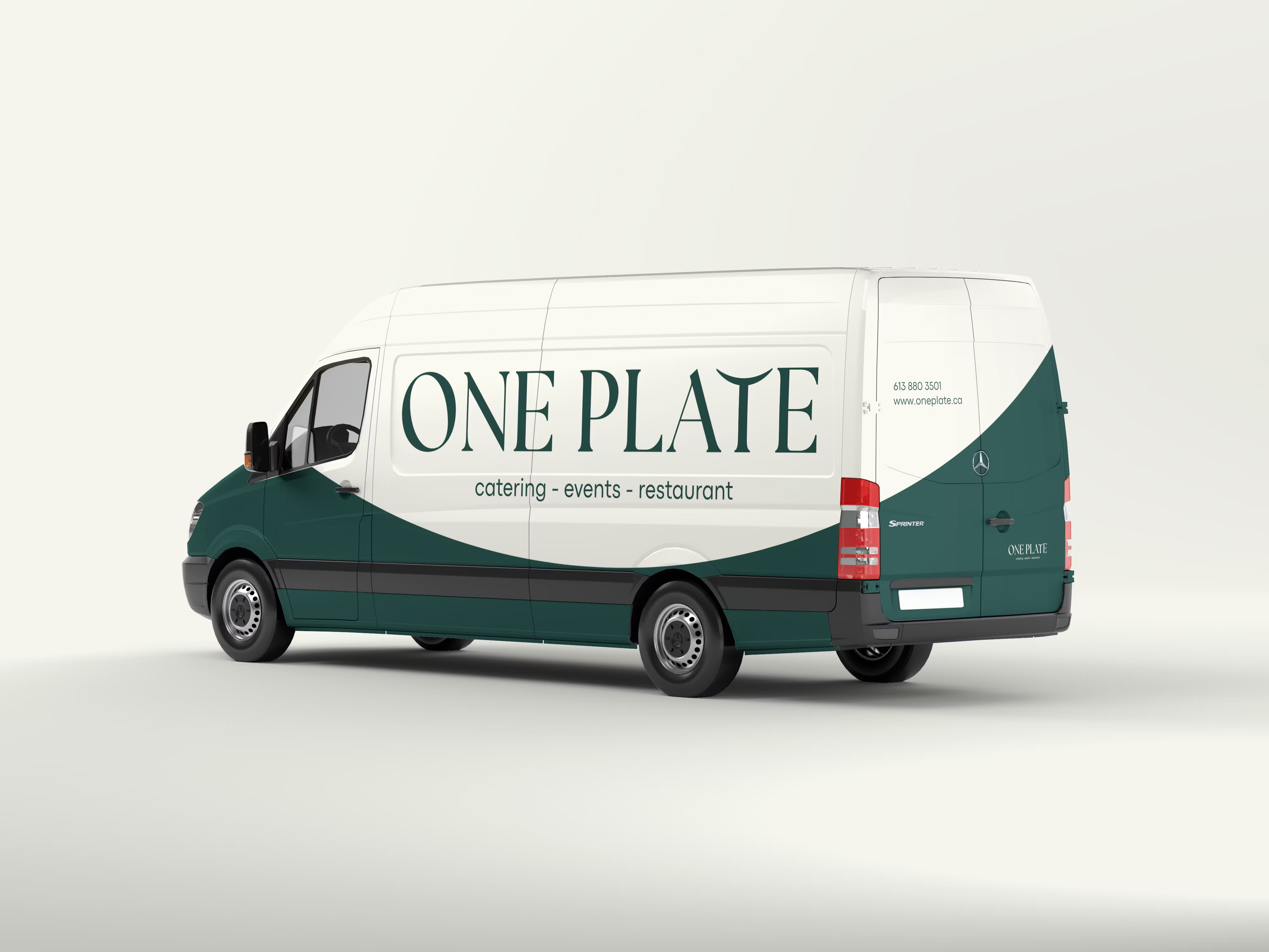
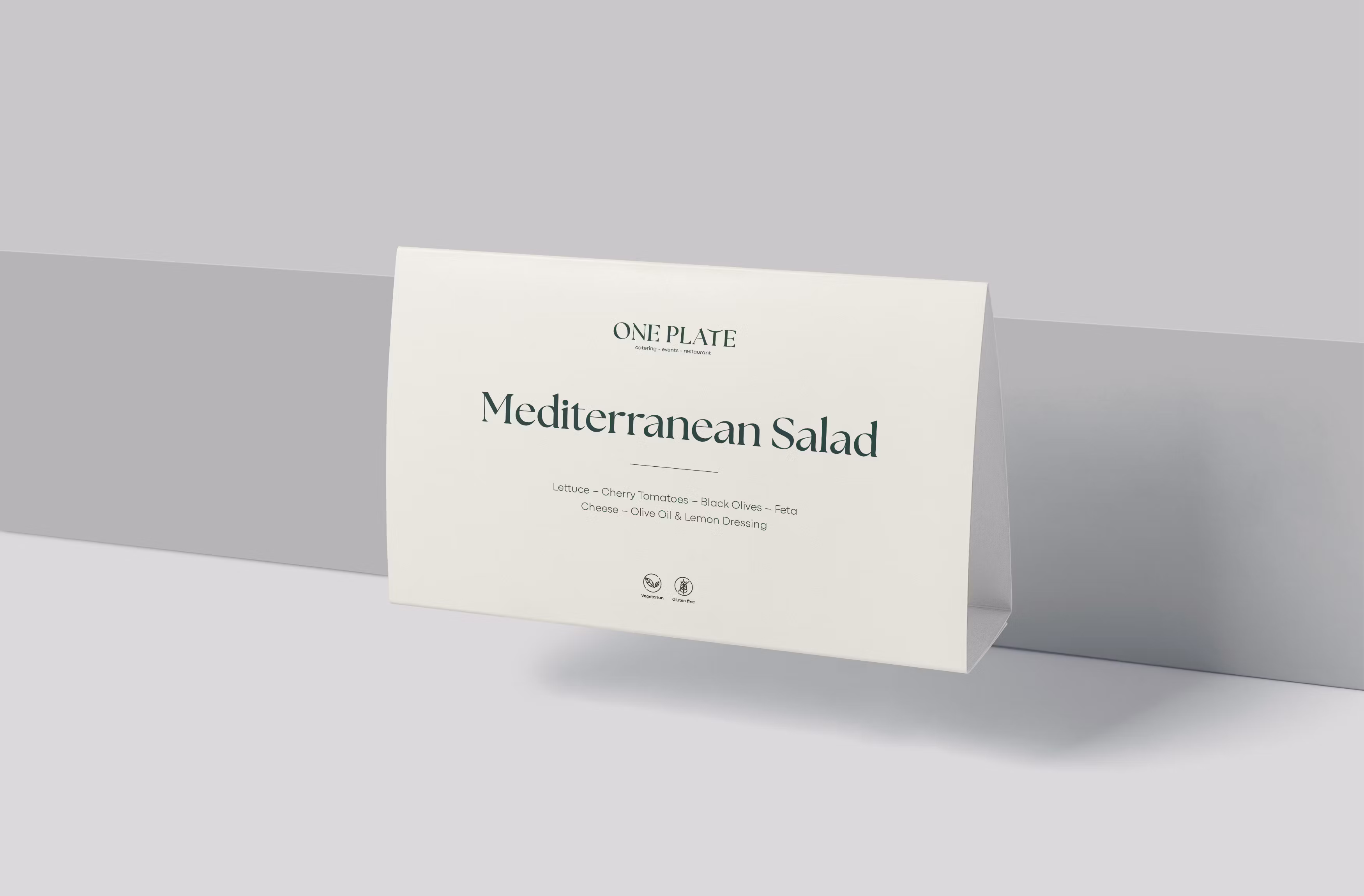
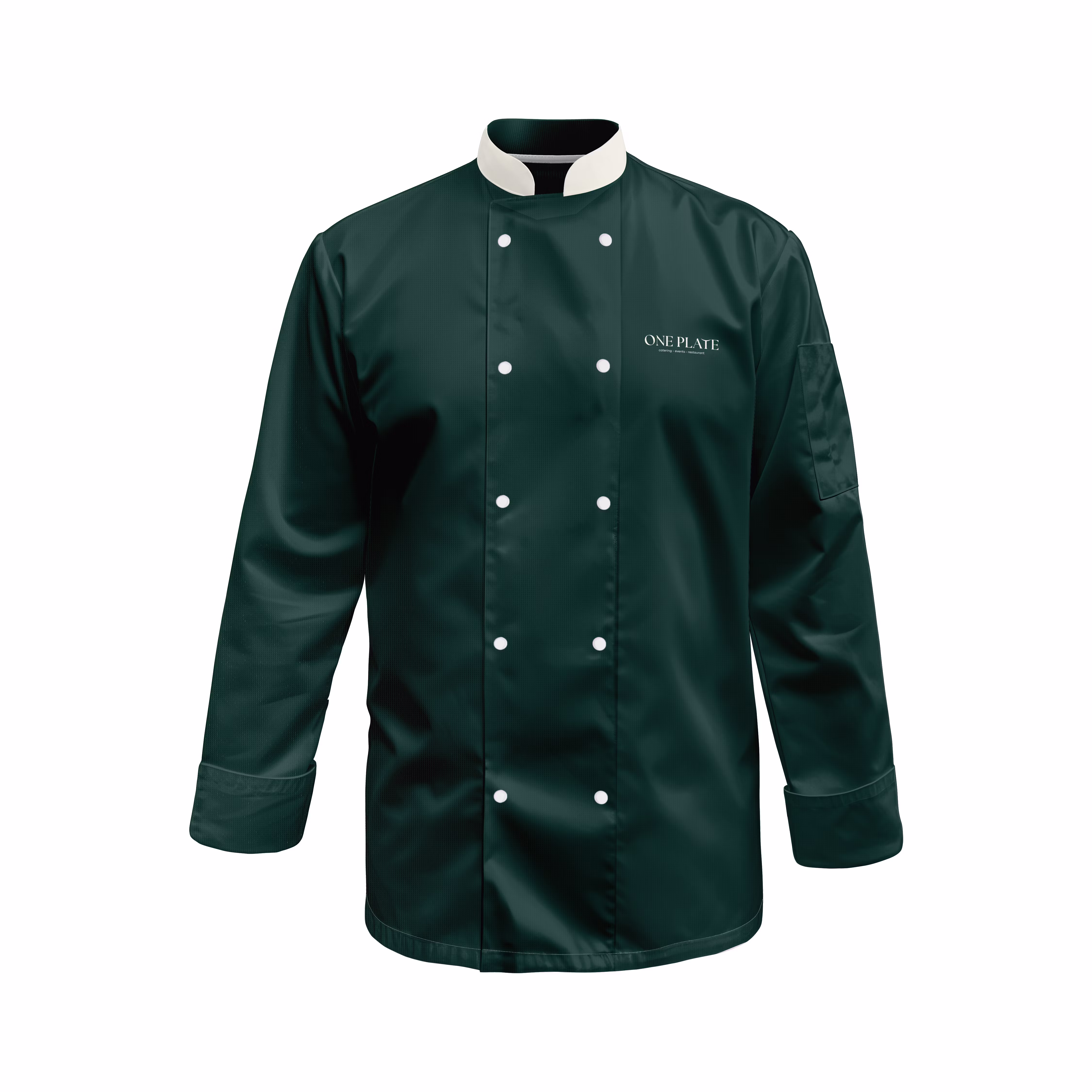
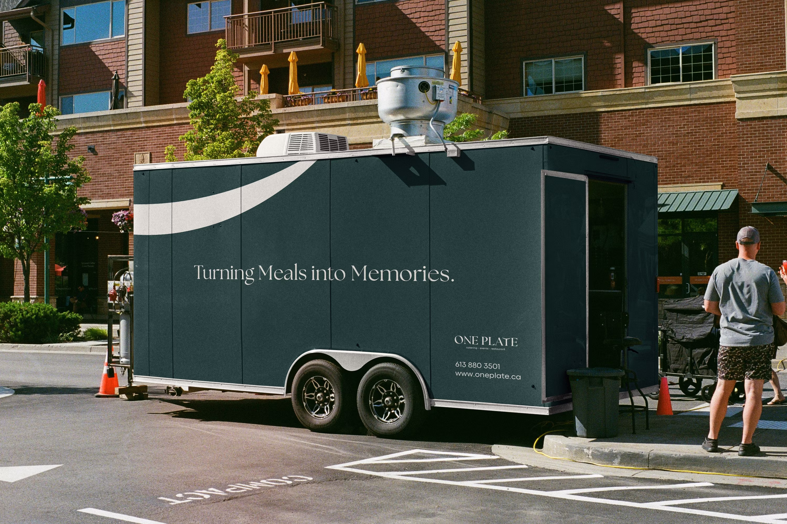
Logo & Visual Identity
Pricing Strategy
Website
Videography
Challenge:
Behind the name "River Lounge" was a catering company executing flawless events at the National Gallery of Canada and Ottawa's elite venues. Despite their exceptional quality and artistry, the casual name created a disconnect with their premium service, making it difficult to command rates that reflected their true value and attract discerning clients who appreciated their craft.
Solution:
We repositioned River Lounge as One Plate Catering & Event Management with a complete rebrand: strategic positioning, sophisticated visual identity, new website, and premium pricing strategy that reflected their true value. The narrative shifted from "catering service" to "culinary artistry and unforgettable experiences."
Outcomes:
Attracted premium clients who recognized the difference between catering and culinary artistry
Implemented elevated pricing that reflected their exceptional quality
Established positioning as curators of unforgettable events, creating a foundation for growth in Ottawa's competitive hospitality market


.png)
.png)


.png)

.png)

.png)
