
.png)
Client:
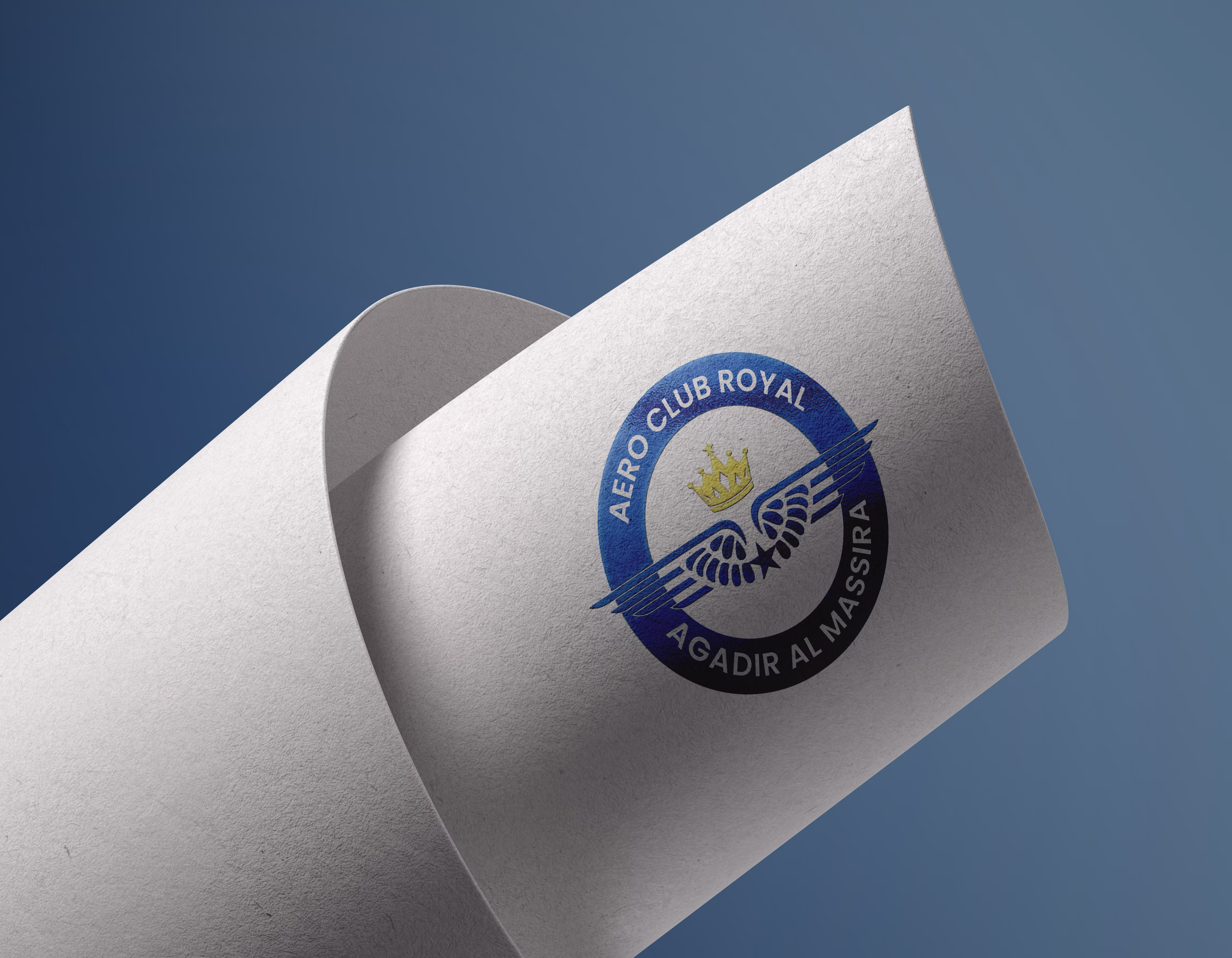
Aero Club Royal Agadir Al Massira
Industry:
Aviation & Flight Training
Location:
Agadir, Morocco
Our Role:
Brand Discovery
Brand Strategy
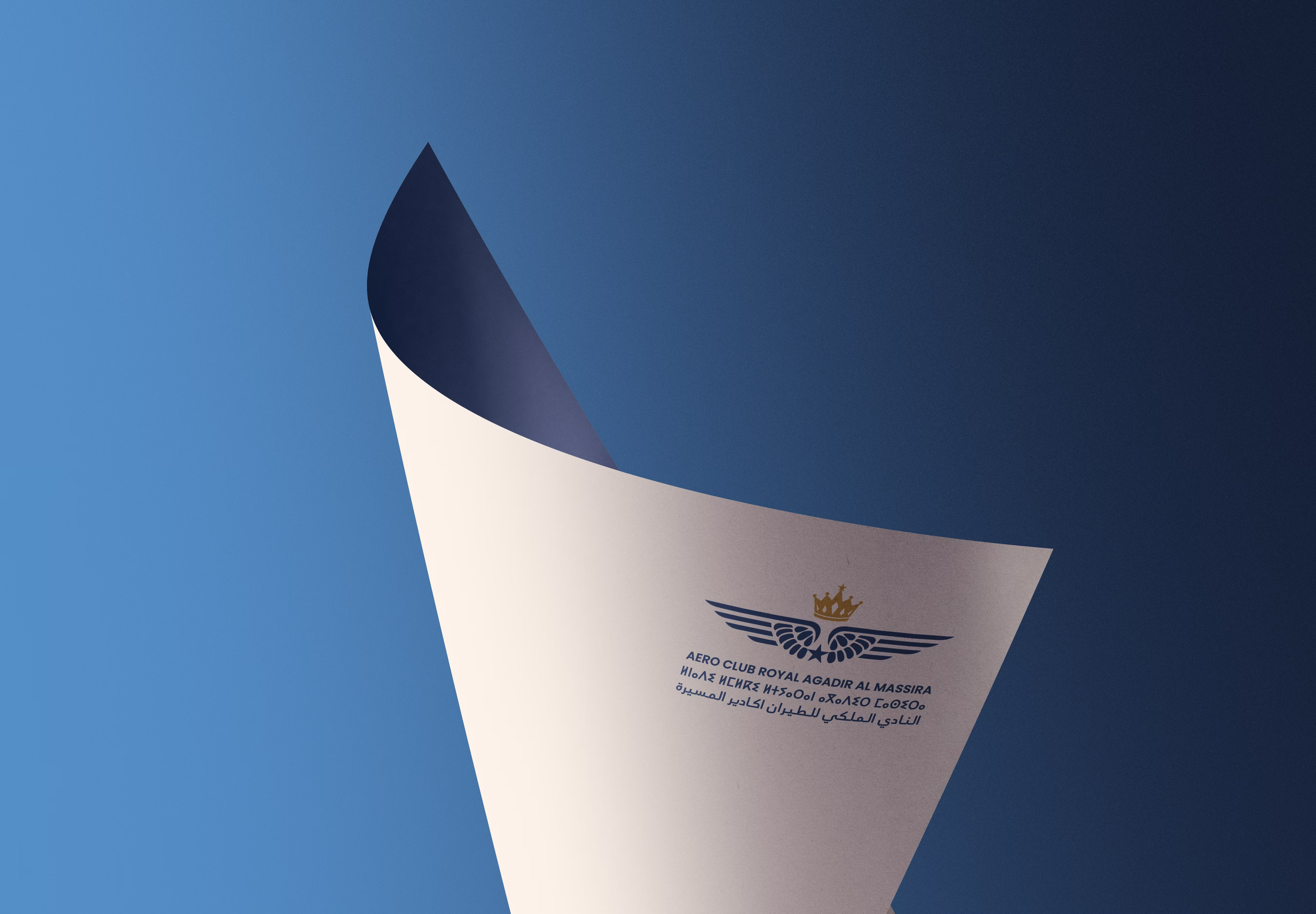
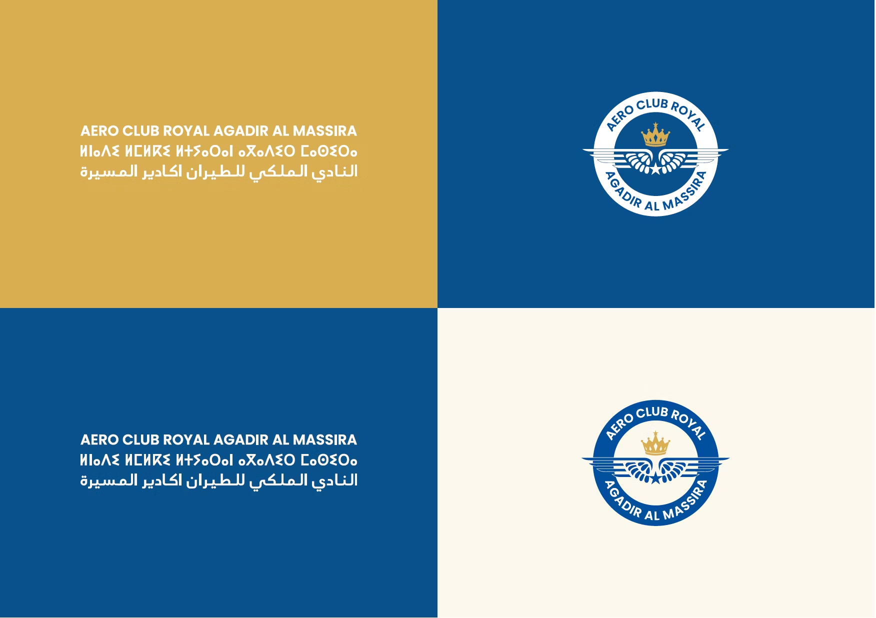
Trilingual Typography (French, Arabic & Amazigh)
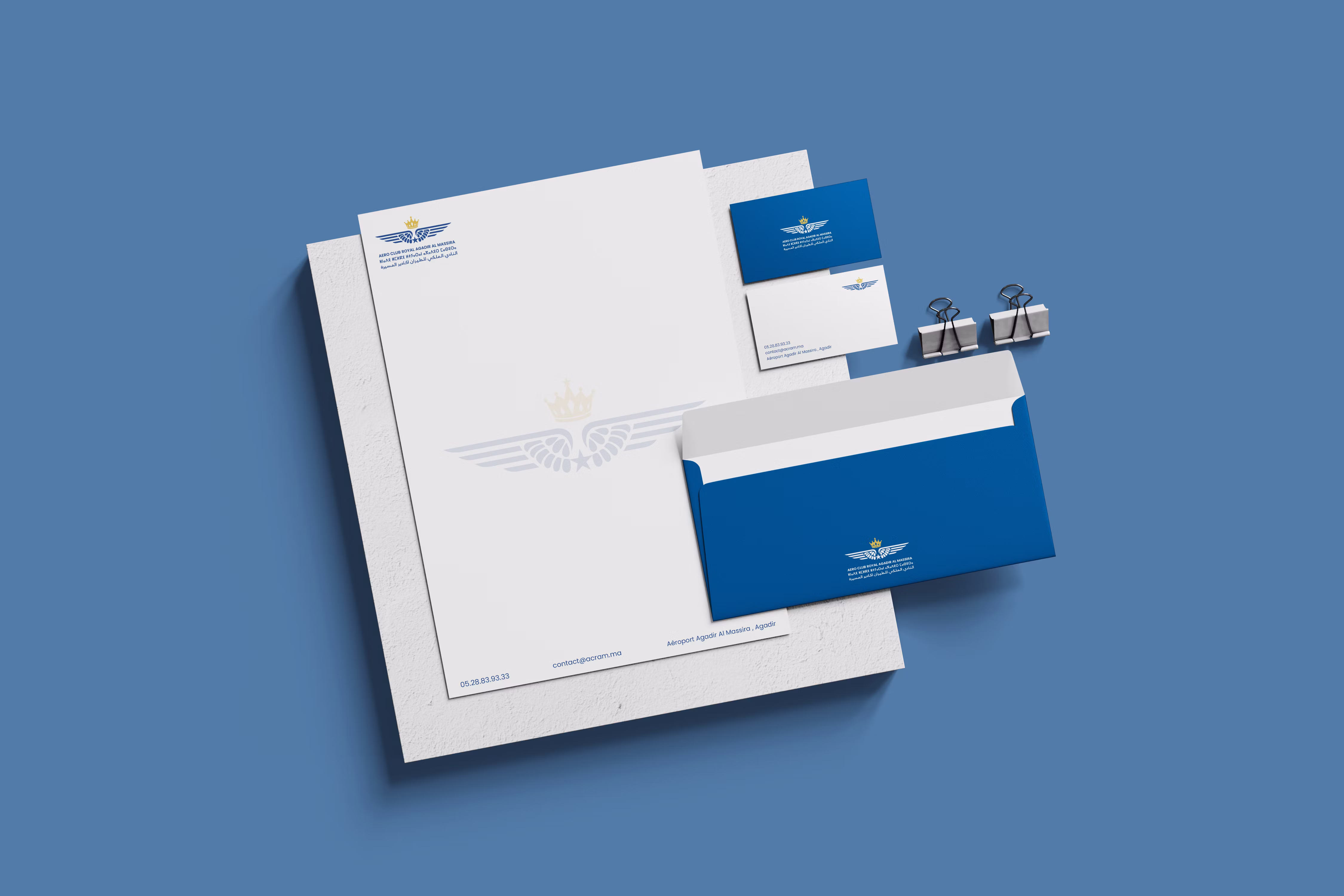
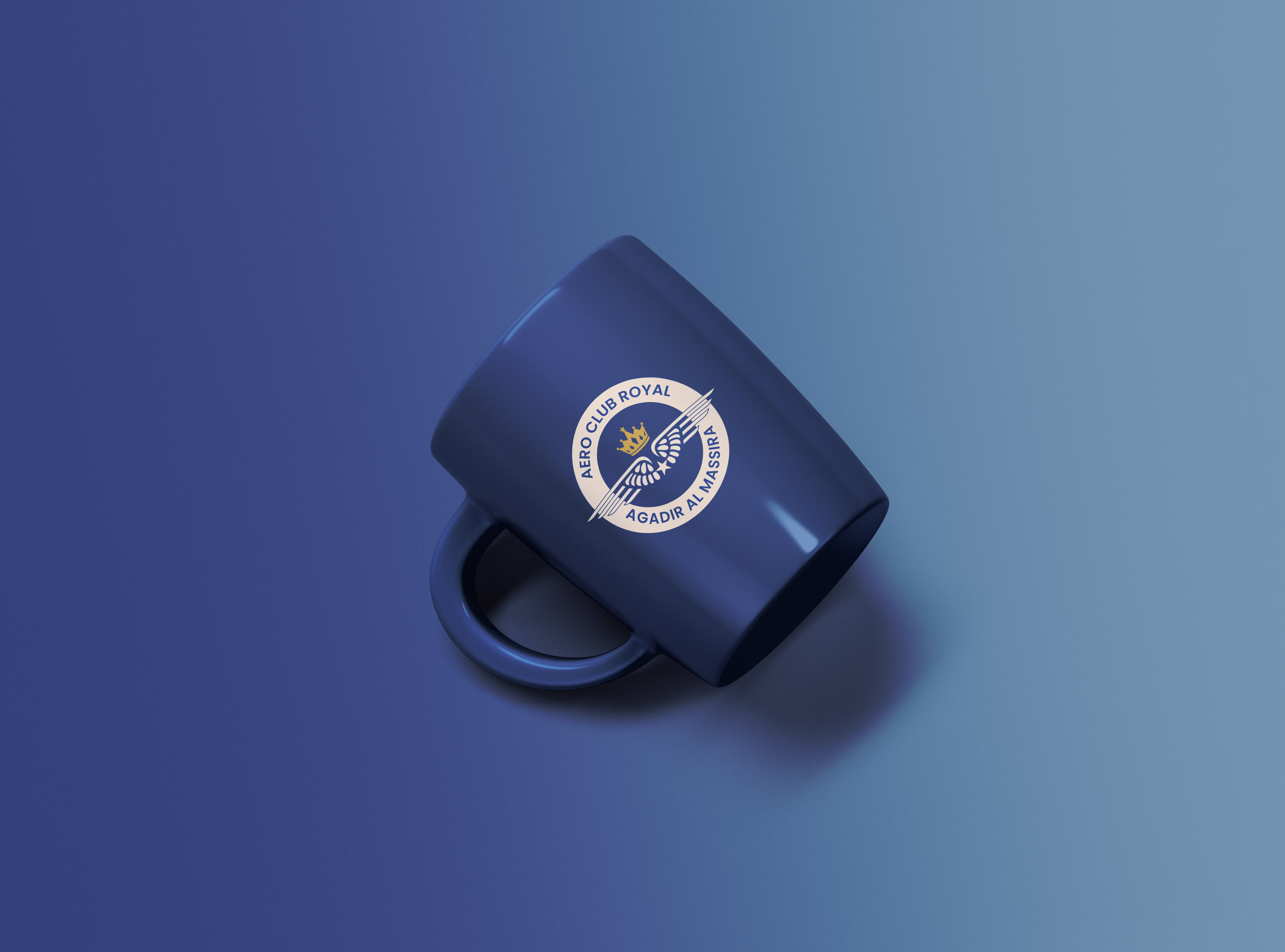
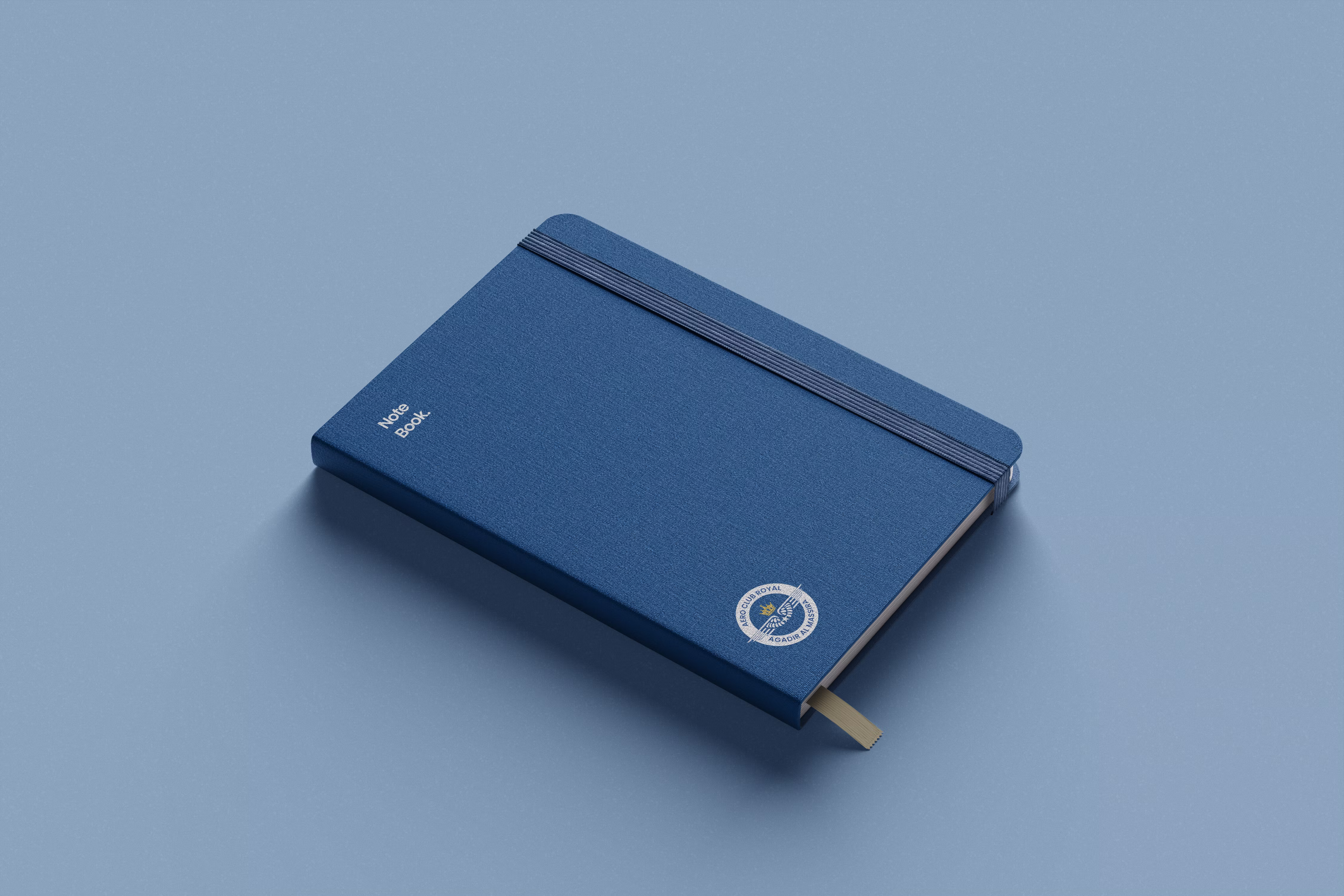
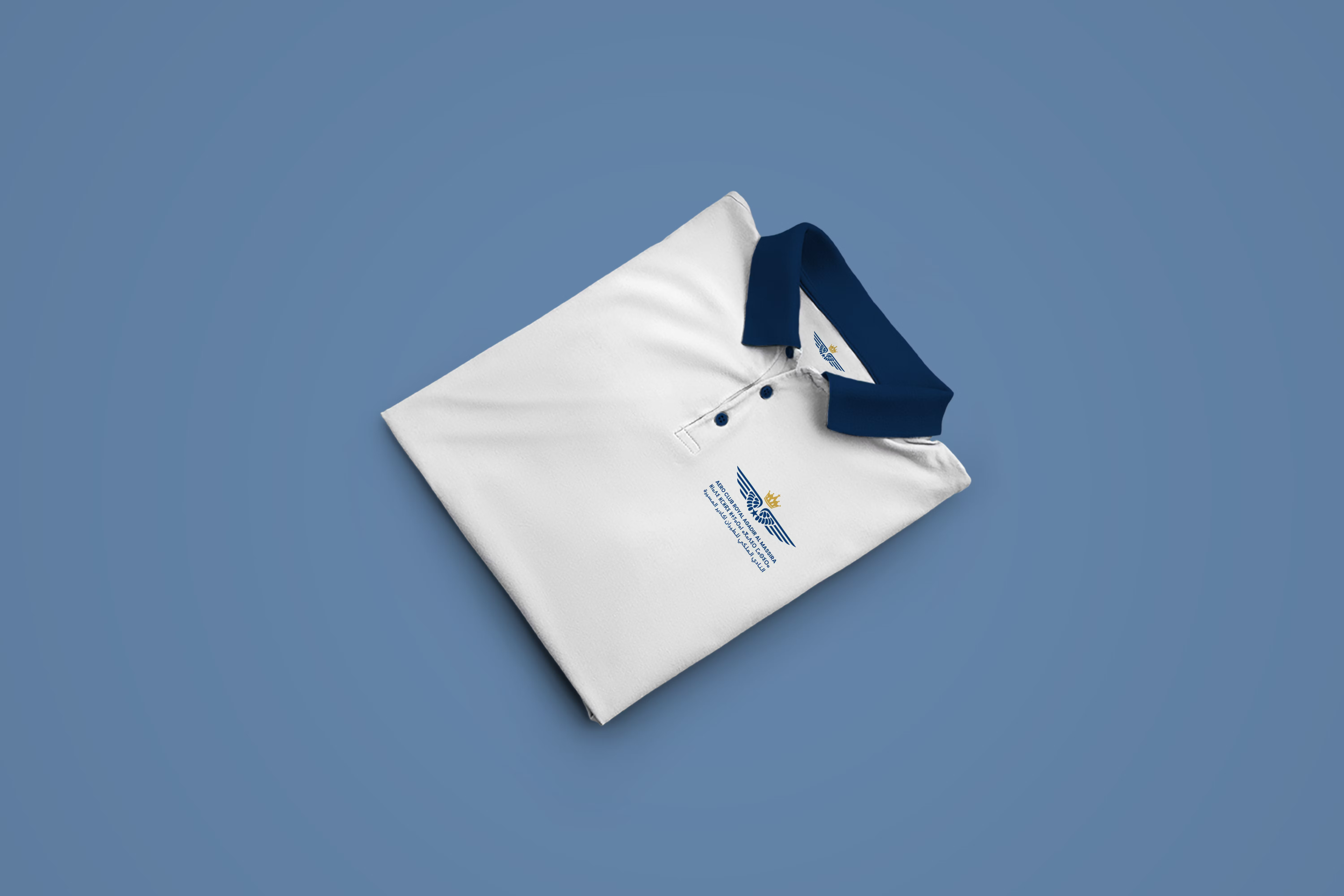
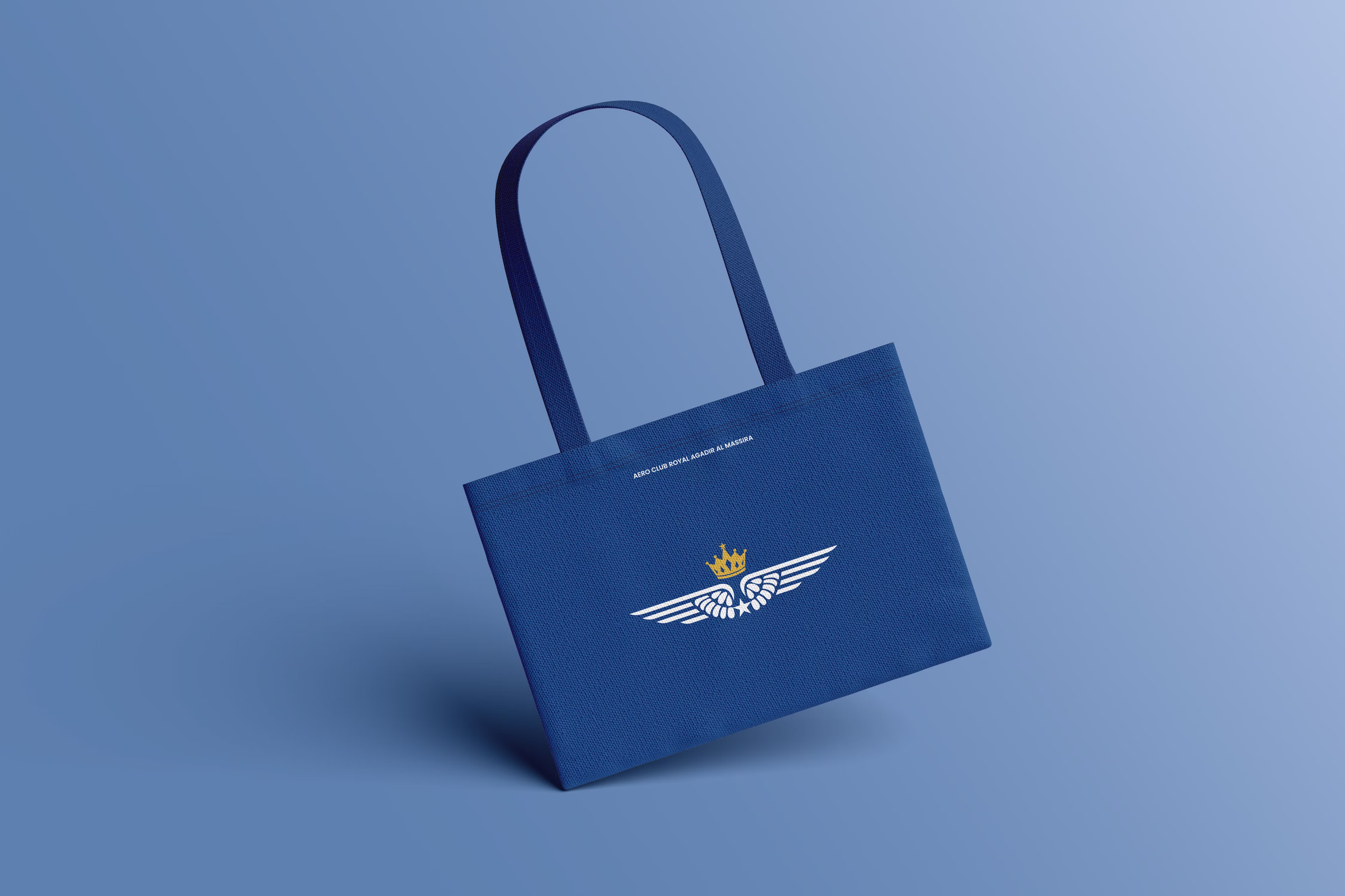
Brand Applications & Mockups
Logo & Visual Identity
Brand Guidelines
Marketing Collateral
Challenge:
Aero Club Royal Agadir operated as a royal aviation club with exceptional flight training programs, but their brand didn't reflect their elite status. Without a cohesive visual system conveying royal prestige and aviation precision, they struggled to attract the recognition their institution deserved.
Solution:
We created a distinctive brand identity with three symbolic elements: wings blending aircraft precision with eagle feathers, a golden crown symbolizing royal prestige, and a five-pointed star echoing the Moroccan flag. The visual system balanced deep blue (aviation mastery) with clean gold (excellence) on sophisticated cream. We developed trilingual typography honoring Morocco's linguistic diversity while maintaining modern professionalism.
Outcomes:
Established the club as a prestigious institution worthy of its royal designation
Created professional consistency across all touchpoints from uniforms to digital platforms
Successfully communicated dual identity as guardian of aviation tradition and modern training institution
.avif)
.png)
.png)


.png)

.png)

.png)
